Okay, so I wanted to make a Stephen Curry poster, I got this idea stuck in my head and just had to do it. First, I grabbed my iPad and fired up Procreate, this is my go-to app for drawing. I started with a rough sketch, just getting the basic pose down. Curry is always in motion, so I looked up a bunch of photos online, trying to capture that dynamic energy he has on the court.
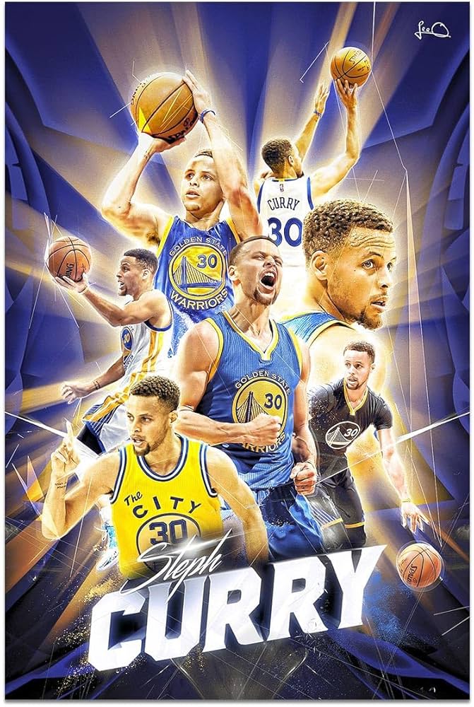
After I got the sketch right, I started laying down the base colors. I wanted to make sure the colors of his Golden State Warriors jersey really popped, you know, that bright yellow and blue. It took a while to get the shading right, I kept going back and forth, adjusting the hues until it looked just like the real thing.
Layering and Details
- Next up was adding layers. I created separate layers for the background, Curry’s figure, the basketball, and the little details like the sweat and the texture of the court. This made it super easy to edit each part without messing up the others.
- I spent a good chunk of time on the details. Getting his face to look like Curry was tough! I zoomed in and out, tweaking the eyes, the nose, the mouth. I even added tiny highlights to make his skin look more realistic.
- The basketball was another challenge. I wanted it to look like it was in mid-air, about to go through the hoop. I used a reference photo to get the lighting right, making sure the shadows and highlights were accurate.
Then, I worked on the background. I didn’t want anything too distracting, so I went with a simple gradient. I chose colors that complemented the Warriors’ theme, a soft blue that faded into a warm yellow. It felt like it captured the vibe of a game night.
Finishing Touches
- Once everything was in place, I added some finishing touches. I used a splatter brush to create a sweat effect, making it look like Curry was really in the middle of an intense game. It added a lot of life to the piece.
- I also added some text at the bottom, just his name and number, “Stephen Curry 30.” I picked a font that looked sporty and bold, something that matched his playing style.
Finally, I exported the finished piece from Procreate and saved it to my computer. I wanted to see it on a bigger screen, so I opened it up in Photoshop. Here, I made some minor color corrections and resized it to fit a standard poster size. I printed out a test copy on regular paper, just to see how it looked in real life. Seeing it printed out was so satisfying!
After a few more tweaks, I sent the final version to a professional printing service. I chose a glossy finish to make the colors really stand out. A few days later, the poster arrived, and it looked amazing! I hung it up in my room, and it’s now my favorite piece of wall art. It’s a great reminder of the fun I had making it and, of course, a tribute to one of the greatest basketball players ever. Overall, it was a blast creating this poster, and I’m already thinking about what my next project will be.